
Start with the work environment, not the logo
When businesses choose uniform colours, the first question should be where the clothing will be worn. A colour that looks smart in an office can become a problem on a construction site, in a warehouse, or on a delivery route around Durban North and Pinetown. Dark shades hide dust and minor marks better, while lighter colours can feel cooler in hot weather and are often easier to keep looking fresh for client-facing teams.
In coastal areas like Umhlanga, La Lucia and Ballito, humidity and salt in the air can also affect how garments age. A pale shirt may show sweat marks faster, but a deep colour can fade sooner if washed hard and dried in strong sun. The practical answer is usually to match the colour to the job, the washing routine and the amount of public contact your staff have.
Choose colours that support your brand and keep the logo readable
Your uniform colour should work with your logo, not fight it. If your logo has a lot of detail, a plain shirt colour often gives the best result for embroidery and printing. Strong contrast helps the branding stand out from a distance, which matters for reception teams, sales reps and event staff.
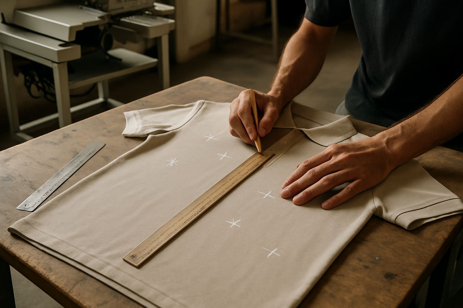
It helps to test a few combinations before placing a bulk order. Some colours look great on a sample card but behave differently on fabric once stitched or printed. For example, a light gold logo can disappear on beige, and a navy logo may vanish on black. Jason on the digitising side will usually recommend how fine detail, small lettering and border colours will read on the fabric before production starts.
- High contrast works best for small logos and text
- Mid-tone shirts often suit white, navy or black branding
- Very bright shirts can overpower subtle logos
- Two-colour garments can help separate departments or roles
Think about repeat ordering before you settle on a shade
One of the biggest mistakes is picking a colour that is hard to source again six months later. If you need uniforms for a growing team, schools, clubs or franchise-style outlets, consistency matters. A colour that is slightly off on the next batch can make the whole team look mismatched, even if the logo is perfect.
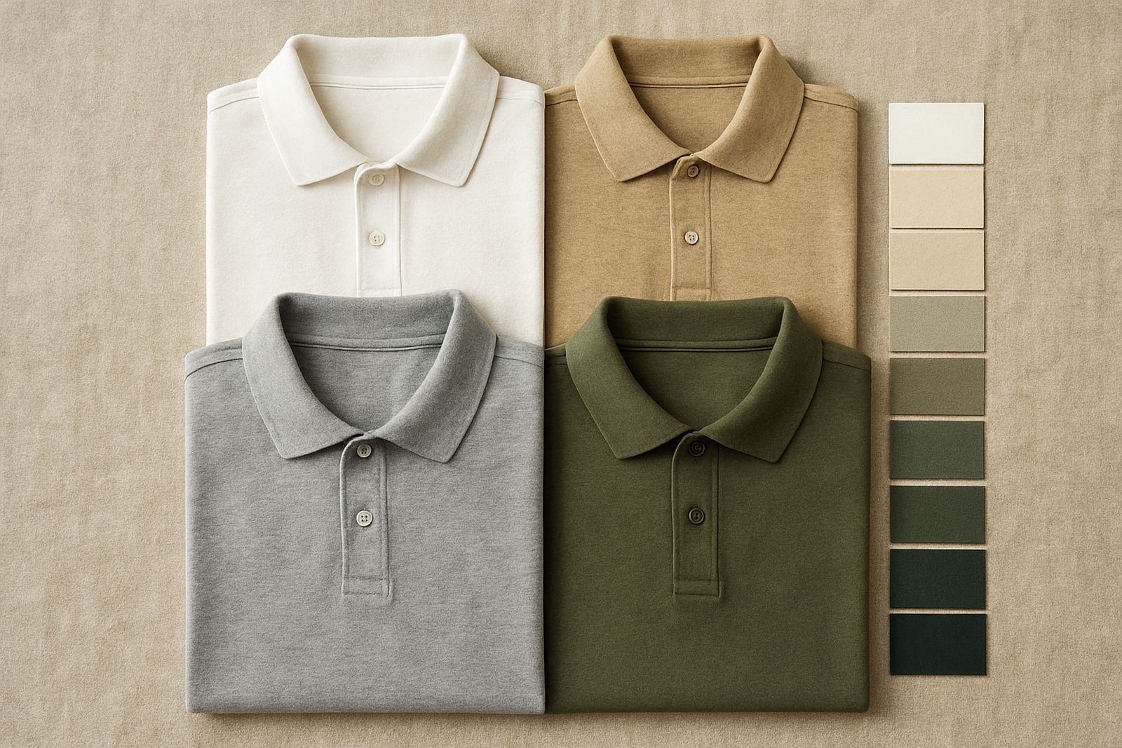
That is why many businesses stick to practical standards such as navy, black, white, charcoal, bottle green or red. These shades are easier to reorder, easier to mix across sizes and more likely to remain available for future bulk orders. If your team expands from ten shirts to fifty, the colour should still be repeatable without a long wait or a replacement shade that looks almost right but not quite.
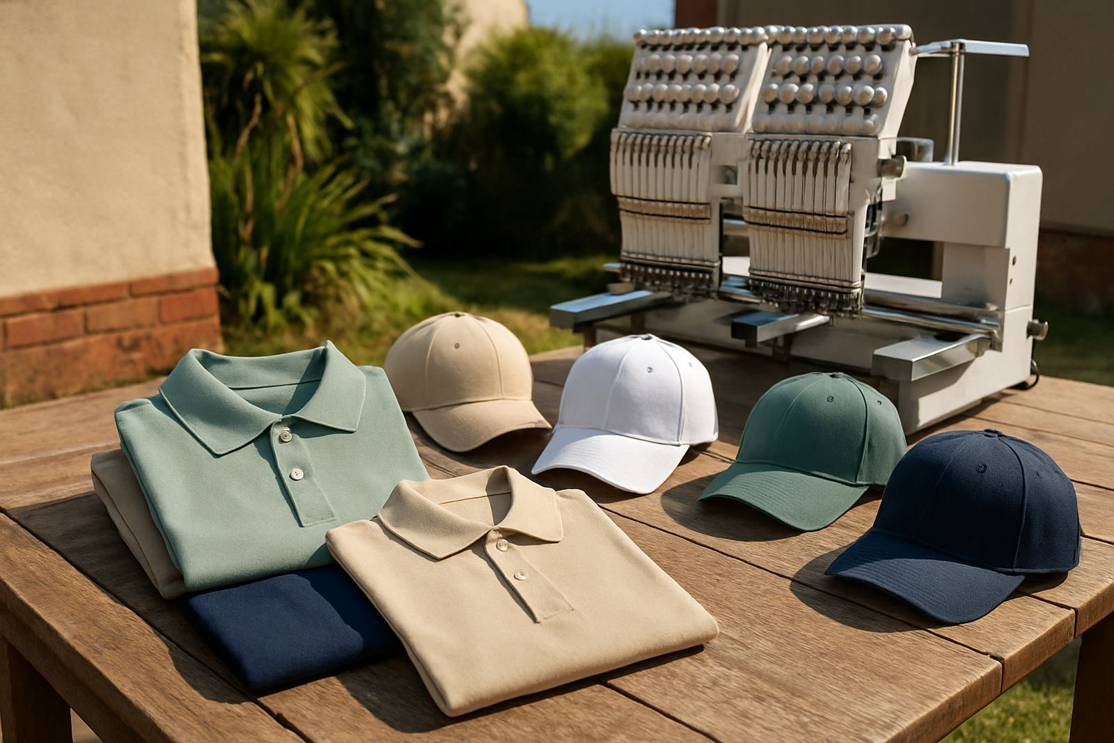
For uniform packs, it also helps to choose a main colour that works across golf shirts, caps and jackets. That way the team can look coordinated without every item needing to be the exact same tone.
Use colour to separate departments and job roles
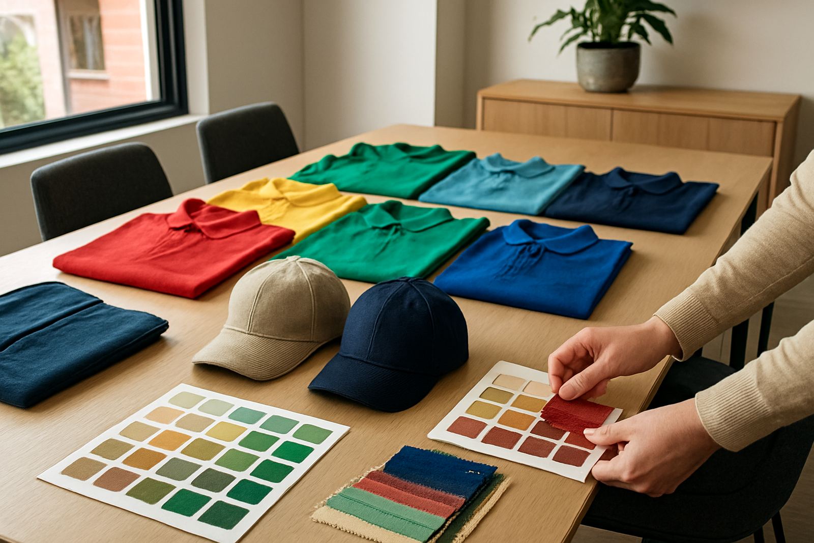
Colour coding can save time inside a business. It helps customers and staff quickly identify who does what, especially in busy environments such as schools, hospitality, logistics yards and maintenance teams. A simple colour plan often works better than trying to fit everyone into one uniform style.
Here are a few practical ways businesses use colour:
- Reception or front-of-house staff in lighter, cleaner-looking tones
- Field teams in darker colours that hide wear and dirt
- Supervisors in a different shade for easy identification
- Club volunteers in the same colour but with different cap branding
- School support staff in durable, easy-to-wash colours
This approach is especially useful when you are ordering for more than one site across eThekwini. A group in Westville may need a different look from a team working near the coast or on a dusty inland route.
Match the colour to the printing or embroidery method
Not every colour behaves the same under embroidery, screen printing or heat press printing. Some shirts hold stitched logos beautifully, while others are better suited to printed artwork with flatter colour blocks. If the garment colour is too busy or too close to the logo colour, the finished result can lose impact.
With embroidery, plain shirt colours usually give the cleanest finish. With screen printing, strong solid colours can help logos pop, but too much texture or too many shades can affect the final look. Heat press printing is useful for certain short-run jobs, but again the shirt colour must allow enough contrast for the branding to remain readable.
For caps, the colour of the crown and peak should be considered together. A black cap with a dark logo can look neat, but a light cap with dark stitching is often easier to read from a distance. The same applies to promotional items such as bags and aprons where logo visibility is everything.
Plan for washing, sun and day-to-day wear
Uniforms in South Africa need to hold up to real conditions. That means regular washing, strong sun, load-shedding drying cycles and the kind of daily wear that comes with active teams. Some colours show lint, fading or staining more quickly than others. If the garments are used in a hands-on environment, that matters as much as appearance.
Dark colours can be practical, but they may show dust, thread pull marks and colour fade over time. Very light colours can look crisp, but they may show tea marks, dust and underarm stains faster. Mid-tones are often the safest middle ground for long-term use. They keep a decent appearance without being too unforgiving.
It is also worth considering how the uniform will be stored and packed. Bulk orders for schools or clubs in Hillcrest, Ballito and Mount Edgecombe often need neat sorting by size and department, so colour choice should work with the packing system too.
A Durban North example that keeps things practical
A local delivery and sales team based in Durban North might need uniforms that work from office visits in Umhlanga to stock runs through Pinetown and site checks in Westville. In that case, a navy golf shirt with a white embroidered logo often gives a professional look without being too formal. A charcoal cap can finish the set, while a lighter second garment can be kept for events or warmer days.
If the same business wants a small promotional giveaway, it may be better to use a simpler colour that is easy to print in bulk and easy to reorder later. The key is not to chase a trendy shade. It is to pick colours that suit the work, the brand and the next order, not just the first one.
That kind of planning saves money over time, because fewer garments get written off and the team keeps a consistent look across seasons. In practice, that is what most businesses want: uniforms that still look decent after a long week, not just on day one.