Start With the Garment, Not Just the Logo
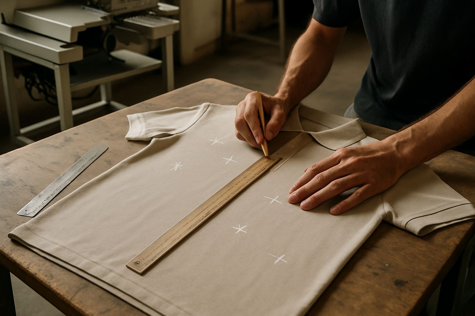
Before deciding where a logo should go, look at the item itself. A golf shirt has a different fit to a button-up shirt, a jacket, or a cap, and each one gives you a different amount of usable space. A logo that looks neat on a mock-up can feel too high, too low, or simply too large once the garment is on a person.
We usually check three things first: the fabric weight, the stretch of the item, and how often it will be washed. Cotton-rich golf shirts and polycotton work well for embroidery and printing, while some lightweight sports fabrics are better suited to smaller placements. If a client in Umhlanga wants staff shirts for a front office, the placement can be clean and subtle. If it is for a school sports day in Pinetown, the artwork may need to be more visible from a distance.
Durban humidity also matters. On coastal garments, especially lighter shirts, thread density and print coverage need proper planning so the logo sits flat and wears well. That is why artwork checks and sample runs are useful before a bulk order goes out.
Chest Placement That Works for Most Corporate Wear
The chest is the most common position for business branding because it is easy to read and looks professional. A left chest logo is usually the first choice for corporate wear, golf shirts and school staff uniforms. It keeps the branding visible without taking over the whole shirt.
For most adult shirts, the left chest sits neatly around 8 to 10 cm wide, depending on the logo shape. A round emblem, school badge or small company mark often works well here. If the logo is very detailed, digitising needs to be handled carefully so that small text does not fill in during embroidery.
Right chest placement is less common, but it can be useful for a name, title, or second mark. Some clients use the right chest for a school house name or department. The key is balance. Too much on both sides can make the shirt feel crowded, especially on smaller sizes like extra small or junior wear.
- Best for office staff, sales teams and school uniforms
- Good for neat, visible branding without overloading the garment
- Works well on polos, wovens and lightweight jackets
Sleeve Branding for Extra Visibility
Sleeve placement is a practical choice when you want a second branding point without changing the front of the garment. It works especially well for clubs, events and trades that want sponsor logos or department names added neatly. On golf shirts, the sleeve can carry a small logo, a short name, or a single line of text.
The sleeve area is smaller than most people think, so size matters. A logo that is too wide can wrap around the arm and become hard to read. For short sleeves, we usually keep the design compact and place it where it is visible when the wearer stands or moves. On long sleeves, there is a bit more flexibility, but the placement should still avoid the elbow bend and cuff area.
For teams working outdoors around Ballito or La Lucia, sleeve branding can help with visibility at events, especially when staff are moving around. If the garment is heavily used, embroidery is often better than a large print because it handles wear well. That said, a light printed sleeve mark can also be a good choice for quick promo runs, if the fabric allows it.
Back Logos for Events, Teams and Sponsors
The back is the best place for a logo that must be seen from a distance. It is popular for event staff, school groups, club committees and promotional teams. A back logo can be just a mark at the yoke, a medium-sized logo between the shoulder blades, or a large print across the back for stronger visibility.
Large back branding should be used with care. It can look strong, but it also changes the feel of the garment and may add cost. For embroidery, larger back pieces need more stitch time and proper stabilising. For printing, the fabric must sit flat and the artwork must be set up correctly to avoid distortion.
In a practical setting, a company in Westville might choose a small left chest logo for everyday wear, then add a larger back print for a weekend activation or expo. That gives them two different uses from the same shirt style. For uniforms that need to be worn daily, we often suggest keeping the back simple so the garment still feels comfortable in hot weather and during long shifts.
- Useful for event crews, sportswear and school group orders
- Works well when visibility matters more than subtlety
- Can be combined with chest branding for a complete uniform look
Cap Branding Needs Tight Planning
Caps have their own rules because the front panel is curved and smaller than a shirt front. A logo that looks fine on paper may need to be simplified for cap branding. The most common position is the centre front, where the design is seen immediately when the cap is worn. Side placement can work too, but it is usually reserved for small marks or sponsor details.
Embroidery is often the first choice for caps because it gives good detail on structured panels and holds up well in daily use. The logo must be digitised with cap shape in mind, especially if it includes fine lettering or a narrow icon. If the stitch count is too high, the cap can lose shape. If it is too light, the design may not stand out.
We often advise clients to keep cap logos simple and clear. A short name, an emblem or a bold monogram usually gives the best result. For schools and clubs around Hillcrest and Mount Edgecombe, cap branding is popular for events, fundraising and team wear because it is practical and easy to distribute. It also packs neatly for delivery, which helps when orders need to go out quickly.
What Changes the Best Placement Choice
There is no single placement that suits every order. The best option depends on the purpose of the garment, the logo detail, and the quantity needed. Bulk orders often allow more room for consistent placement, while small rush orders may need a simpler setup so production can move faster. If a client wants a 24-hour turnaround, the artwork must be ready, the logo must suit the chosen method, and the placement must be clear from the start.
Artwork checks are important because even a well-designed logo can cause problems if text is too small or spacing is too tight. A clean logo usually gives the best result on embroidery, screen printing or heat press printing. For more detailed branding, a sample run is a sensible step before a large order goes into production.
When we work with businesses across eThekwini, we look at the full use case. A Durban North office team might need subtle chest logos on corporate wear, while a school club in Pinetown may want a stronger back print for visibility on sports day. The right placement keeps the uniform looking professional and helps the brand do its job without getting in the way.
A Simple Local Example That Shows the Difference
Imagine a client in Durban North ordering golf shirts for a small team that meets clients during the week and attends community events on weekends. For daily wear, the best layout may be a left chest embroidered logo, with a small sleeve mark for added identity. That gives a tidy, professional look and keeps the shirt comfortable in the heat.
If the same team needs promo shirts for an expo in Umhlanga, the placement could change. A larger back print may work better for visibility from across a hall, while the chest logo stays compact. If caps are included, the front panel can carry a simplified version of the same mark so the whole order looks consistent.
This is why good logo placement is about planning, not just decoration. The right position makes the item easier to wear, easier to read, and better suited to the job. A good placement choice saves time later, reduces waste, and gives the final garment a more polished finish.
For businesses, clubs and schools, that usually means choosing the position that suits the item first, then adjusting the artwork to fit. That approach gives better results and fewer surprises when the order arrives.