Start With the Garment, Not the Logo
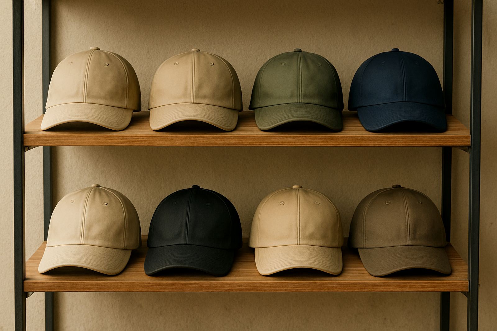
When you are ordering embroidered or printed golf shirts, corporate wear or caps, the garment colour should be chosen first. A navy shirt, for example, gives a very different result from a black or white one, even when the logo stays the same. Dark fabrics can make certain inks look brighter, while pale fabrics can make light thread colours disappear.
In Durban and along the coast, many businesses also choose colours that hide dust, salt air marks and day-to-day wear better. If uniforms are used for site visits, deliveries or outdoor events in Umhlanga, Pinetown or Ballito, the fabric colour must still look tidy after regular washing and sun exposure.
- Check whether the garment is light, medium or dark before choosing logo colours.
- Ask how the fabric behaves after washing, especially if it is a polycotton blend or performance fabric.
- Choose a base colour that suits the setting, staff role and how often the item will be worn.
Know the Difference Between Embroidery and Print
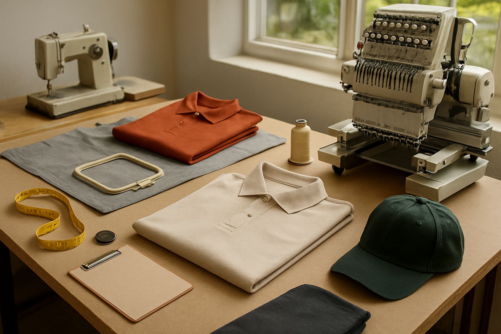
Embroidery and print do not handle colour in the same way. Embroidery uses thread, so the finish is textured and the colour is affected by stitch direction, fabric weave and lighting. Print uses ink or transfer film, so the colour can be flatter, brighter or more detailed depending on the method. A logo that looks crisp in print may need simplification for embroidery, especially where there are fine lines or tiny letters.
If your brand uses a very specific shade, it helps to compare it in the same method you plan to use on the final garments. A red in embroidery may not match the red in screen printing exactly, and that is normal. The goal is consistency across the order, not forcing two different methods to look identical.
- Use embroidery for a more formal, stitched finish on shirts, caps and jackets.
- Use screen printing or heat press printing when you need finer detail, larger logos or strong colour blocks.
- Keep one colour reference for the whole order so everyone is working from the same point.
How to Check a Logo Colour the Right Way
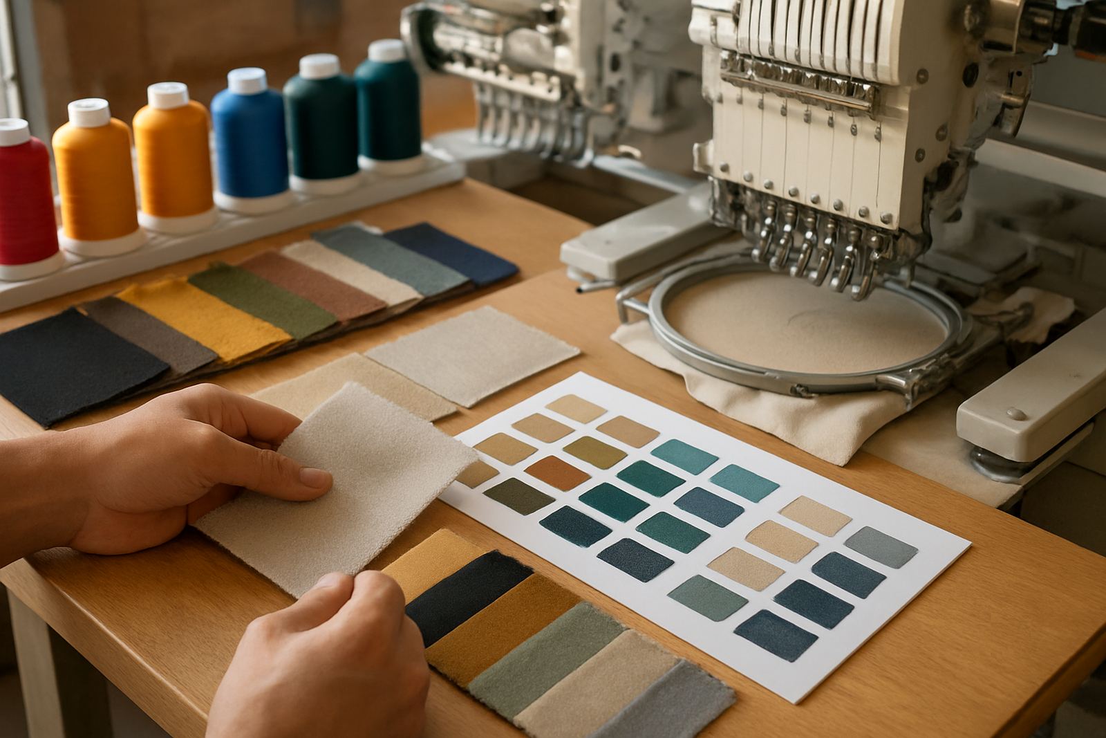
The easiest mistake is approving a colour on a phone screen. Screens shift from device to device, and office lighting can make the same logo look warmer or cooler. The better method is to compare a clean artwork file with a garment swatch, or a sample shirt, under natural light if possible. At our Durban North base, we often advise clients to check colours in daylight before signing off bulk production.
For businesses, clubs and schools, a simple review process avoids last-minute changes. If the logo includes more than one colour, confirm the main colour first, then check the secondary colours and outline. Small adjustments may be needed where a garment is black, charcoal, bottle green or maroon. That is normal and should be planned for upfront, not left for the day before collection.
- Compare the logo against the garment in daylight, not only under office lighting.
- Ask for artwork checks before production starts.
- Confirm the main logo colour, then the secondary colours and any text outlines.
Choose Print Colours That Stay Clear on the Fabric
For printed items, contrast is more important than perfect colour matching. White on navy, black on grey, or gold on bottle green can all work well, but low-contrast combinations may disappear after a few washes or under indoor lighting. If the design is intended for events, staff wear or promotion packs, the print must be visible from a few metres away, not only up close.
Very bright shades can also change slightly when printed on different fabric types. A cotton shirt and a moisture-wicking golf shirt will not take ink the same way, so the same colour can look a little different. If you need a uniform look across golf shirts, caps and promo items, it is worth planning the colour family instead of chasing one exact shade across every surface.
- Use strong contrast for names, logos and contact details.
- Test the design on the exact garment type before approving bulk production.
- Allow for slight variation between fabric types, especially on mixed uniform packs.
When to Ask for a Sample or Test Run
A sample run is the safest choice when the order is large, the artwork is new, or the colours are unusual. It is also wise when the uniforms must match an existing set of shirts, caps or jackets. A single approved sample can save a lot of waste on a 100 piece or 300 piece order, particularly if the business uses staff uniforms across several branches in eThekwini or the North Coast.
Rush orders can still be checked properly, but the process needs to be tighter. If you have a 24 hour turnaround request, please make sure the artwork is final and the garment colour is confirmed before the job is released. That gives the team enough time to digitise, print and pack without avoidable changes.
- Request a sample when the order is large or the logo is being used for the first time.
- Use a test run for new colour combinations or complex artwork.
- Confirm sizes, quantities and final colours before any rush order is started.
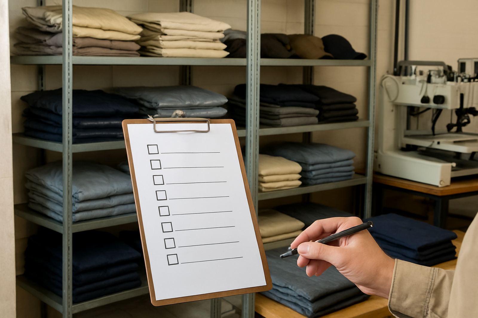
Simple Colour Match Checklist Before You Place the Order
Before you submit an enquiry, gather the basics in one place. That makes it easier for the sales team and production team to check the job properly. A clear brief also helps with uniform packs, cap branding and promotional items, especially when the same logo must work on several different products. If a school in Westville needs shirts and caps, or a business in La Lucia wants staff wear and giveaways, the colour plan should cover every item in the set.
Use this checklist to reduce back and forth. It is also useful for repeat orders because it keeps the same look across seasons and replenishment runs. Good records mean fewer surprises when you reorder later in the year.
- Have the logo file ready in a clean format.
- Confirm the garment colours and the item types in the order.
- Decide whether embroidery, screen printing or heat press printing will be used.
- List the exact quantity for each size and colour.
- State whether the order needs a sample run or a fast turnaround.
- Check that the final artwork, colours and delivery details are all correct before approval.
If you are unsure, send the details through the enquiry form and ask for a colour check before production begins. That way the final result is more likely to match the look you want, and the order moves through production without unnecessary delays.